
Mr. Taylor, my eyesight is starting to fail and I’m finding that my computer’s display colors often leave me puzzled about the words on screen. The problem is that there’s almost no contrast with some color pairs, grey on tan, light blue on dark blue, etc. How can I change my settings so that everything’s more readable so I can enjoy using the computer again? Thank you.
Engineers have designed computer systems for themselves for a very long time, and that trend continues with many devices and interface elements. It’s not necessarily bad, but it can leave a significant number of people with an inferior – or downright frustrating – daily user experience. Anyone who has a color vision deficiency (that used to be known as “color blind”) is going to have problems with bad foreground/background color pairs, but plenty of other people suffer through challenging themes without realizing they can change things with a click or two.
Where all of these computer interfaces have improved is in the area of accessibility. Twenty years ago accessibility might have meant “You’ve got to grin and bear it, sorry” but now there are dozens of settings in every operating system to make things better. Your phone, your tablet, your computer, even your SmartTV can now adjust the user interface to help you have a better experience.
Shortcuts: Mac “Increase Contrast” Mode | Windows Choosing “Contrast Themes”
In that vein, both Mac and PC computers have what’s known as “high contrast” options that can make the interface really pop with far easier to understand interface elements. Better yet, it automatically applies to the vast majority of the apps, utilities, and (sometimes) games you play too. Let’s have a look with both Mac and Windows…
MACOS: “INCREASE CONTRAST” MODE
I’m going to start with this accessibility feature enabled so you can immediately see how the greater contrast dramatically changes the user interface. Here’s the Apple menu:
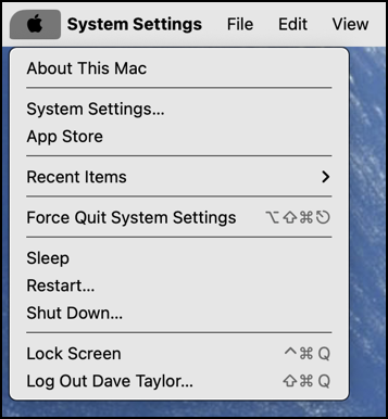
If you compare it to what’s shown on your MacOS system without this enabled, you’ll find that the characters are black, rather than grey, and that the dividing lines between sections of the menu is a heavy, highly legible black rather than grey.
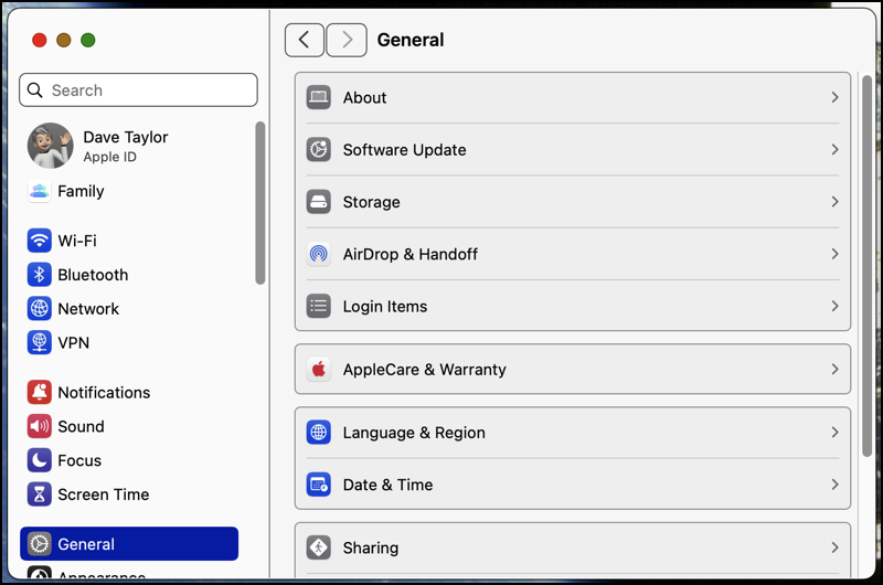
To enable this great feature, choose “System Settings…” from the Apple menu. It will bring up a window you’ve probably seen many times, but check out how legible it is in this Increase Contrast mode:
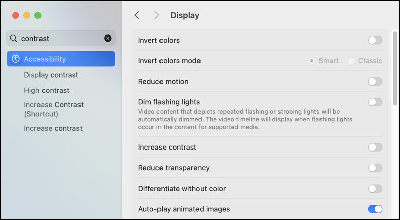
Use the search box on the top left to look for “contrast”:
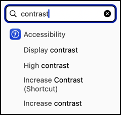
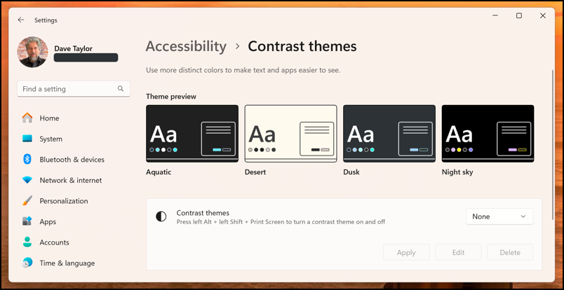
A number of possibilities, but for our purposes, choose “Accessibility“. You’ll then get to exactly the correct spot to enable – or disable – this feature:
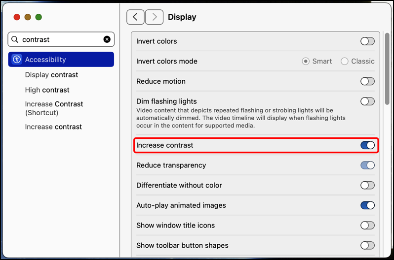
That’s all there is to enabling this helpful setting. If I turn it off, by the way, look at how things change:
This is a great chance for you to compare the two: Which one’s easier to read and less strain on your eyes?
Now, what if you’re on a Windows PC instead of a Mac system? Windows has the exact same setting!
WINDOWS: CHOOSING BETWEEN “CONTRAST THEMES”
Microsoft doesn’t just offer a “more contrasty” interface change, it actually offers a couple of different themes that give you varying types of higher contrast user interface elements. Again, let’s start with it enabled:
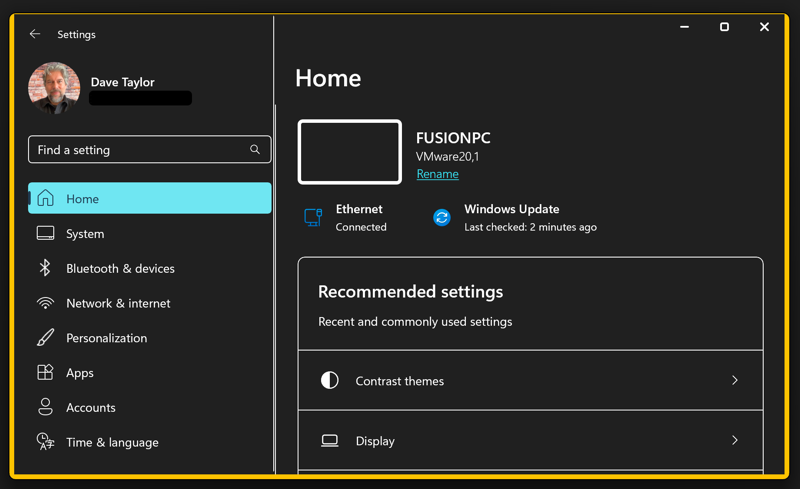
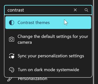
As you can see here in the control panels “Settings” area, this is even more dramatic high contrast theme. If this feels a bit too much don’t worry, there are other options that are a bit less ultra-contrasty. As we did with the Mac, use the search box to seek “contrast”…
Again, how does that display compare to what you’re seeing now on your Windows PC without a high contrast theme selected?
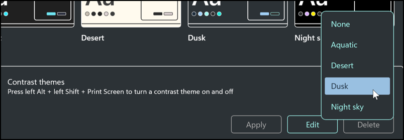
Choose “Contrast themes” and you’ll learn that Microsoft offers up four:
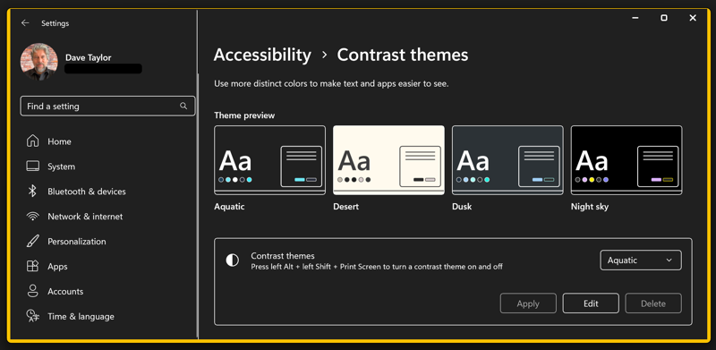
The four possible contrast themes in Windows 11 are Aquatic, Desert, Dusk, and Night sky. Just below the sample thumbnails you can see that there’s a field “Contrast themes” and a menu that shows “Aquatic” for me, at least. Click on it and you’ll find that there are the four choices plus ‘None’:
Let’s switch to “Desert” to see how the tan background looks. The best place to see the difference is in the Notifications window off the Taskbar. Check out just how different it appears:
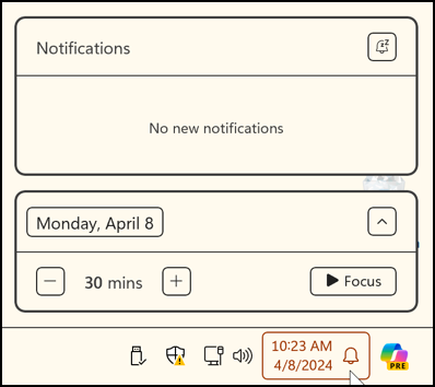
Click on the time on your own Taskbar and compare how it appears in comparison. I actually really like the high contrast themes and find that all of the faint divider lines and borders become heavier and more legible offers a fun and interesting update to the entire user experience. And if you were having problems with contrast? Way better.
Here’s a quick comparison; the Accessibility > Contrast themes if I select “None”:
Now you know how to adjust this for both Windows and MacOS, I hope these high-contrast accessibility settings will help your computing experience be easier and more enjoyable!
Pro tip: I’ve been writing about both MacOS and Microsoft Windows for many years. Please check out my Mac help area and Windows help area for many more useful tutorials while you’re visiting the site!
WHAT ABOUT CONTRAST ON PC’S WITH WINDOWS 10?