
I want to make some joke pie charts for my friends but don’t have a spreadsheet or graphics program. Is there any way I can do so online?
Pie charts are a mainstay of spreadsheets ever since Lotus 1-2-3 back in the day. We see them all over the place, from cookbooks (Get it? Pie charts?) to research reports, newspaper articles to graphics on TV. They are a great way to visualize something as a percentage or fraction of a total, like percentage of Santa’s reindeer that have illuminated noses or breakdown of favorite coffee drinks at the local cafe by sales. Generally speaking these are done within spreadsheet programs and are one of dozens – if not hundreds – of different graphs you can produce to visualize whatever information you’re analyzing.
Fortunately you don’t need to have a spreadsheet program on your computer to build these. There are plenty of free “Office” suites you can download if you want to add a spreadsheet to your computer application folder, of course, from Libre Office to Open Office, but Google Docs, free and accessible within your favorite Web browser, has a spreadsheet called Sheets you can use too! Heck, there’s a shortcut if you’re using Chrome: Just open up the URL “sheets.new” and you’ll be looking at a blanks spreadsheet!
But let’s start at docs.google.com. Go there and you’ll see that the default is to create a new document in Docs, their Web-based Microsoft Word-like program, possibly using one of their handy templates:

Instead, click or tap on the hamburger menu, the three horizontal lines on the top left. That pops open a pane that let’s you choose from between all the different Google Docs document types:

As highlighted, choose “Sheets” to open up a new spreadsheet.
You’ll see a similar set of templates, but for a simple pie chart, just choose “Blank”:

Once you open up a blank spreadsheet, it’s, well, blank. Complicated, but empty:
At this point you’ll want to enter the data for your pie chart as tabular information. A1, for example, can be the label, while B1 is the value. Enter that with as many slices as you desire, then select all the data you’ve just entered and choose Insert > Chart, as shown:
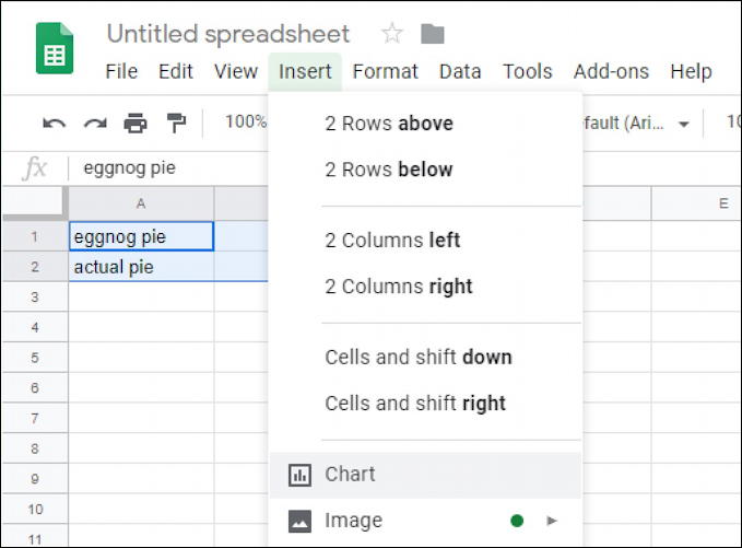
Notice that the four boxes are highlighted: eggnog pie, actual pie, and the numeric values I have specified for each.
Out of the list of charts, choose Pie Chart and it’ll instantly pop up a pie chart with default colors and labels based on the tabular data you’ve already entered and highlighted. Easy, really:
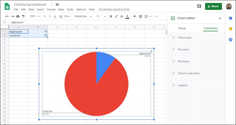
Now you can use the window on the right side to customize things and make the pie chart look better. Notice that at this top level the options are Chart style, Pie chart, Pie Slices, Chart & axis titles and Legend.
Start with “Pie chart”:
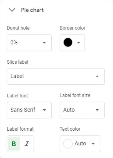
You can add a hole in the middle, but more importantly add a border, change the label style on each slice and change the label font.
Next up, go to “Pie Slices” to change those colors:
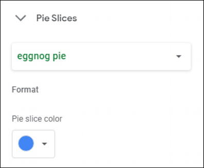
Here you choose each slice by name, then can change the color as desired. Allowing us to create a festive and fun Christmas Pie Preference pie chart to share with the family pre-baking:
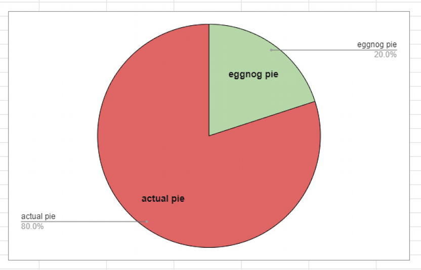
I also slightly tweaked the original values to ensure that there was enough space in the “eggnog pie” slice for the label to appear and be readable. For many pie charts you aren’t going to change the values to match format or layout requirements, but it’s easily done if that’s your preference. And that’s how you make pie charts in Google Sheets without every downloading an app!
Pro Tip: I’ve been writing about computer basics for years here on the site. Please check out my computer and internet basics help library for lots and lots of useful tutorials while you’re here. Thanks!