
I was visiting another blogger’s site and noticed that all her photos and images have a subtle drop shadow. It’s really beautiful. How can I duplicate this functionality on my own site, and maybe even add a border around my images too?
Modern Web browsers work with a lot more than just old-school HTML (hypertext markup language), notably including something called Cascading Style Sheets or “CSS”. CSS is so prevalent that you’d probably have to really dig around to find a site that’s just HTML without any CSS styling applied. The best way to think about this is that HTML is the rough sketch and CSS is the fine tuning that gets things to be exactly as you want. More space between lines? Slightly different colors for your embedded links? Different behavior on having the cursor hover over an element? All of that is easily accomplished in CSS.
And when you get to images and photographs, CSS has an astonishing number of different features and capabilities! The easiest one to work with is borders, actually. For example, here’s an photo I took after I experimentally grilled up both a burger and tater tots on my BBQ:
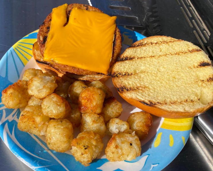
Nice enough and yes, it was quite tasty, including the BBQ’d tots!
But let’s look at how the photo is presented more closely. It’s… kind of boring. The HTML for this image is similar to:
<img src="burger-and-tots.jpg" alt="burger and tots bbq grill plated"
 width="400" height="322" />
You can actually add CSS directly to an individual HTML element by using the style=”” attribute. To add a grey border I can simply specify style=”border:5px solid grey;” like this:
<img src="burger-and-tots.jpg" style="border:25px solid black;"
 alt="burger and tots bbq grill plated" width="400" height="322" />
With this result:
The basic attributes for a CSS border specification are size style color, so 25px solid grey gives us a solid grey border that’s 25 pixels wide. There are lots of different ways you can specify these attributes, actually, something that’s beyond the scope of this tutorial. You can even specify border-left and border-right, for example, and have them be different sizes, colors and styles. I commonly use 1px solid black to add a slim “pencil line” around images so that they stand out from the background but rarely do more than that.
DROP SHADOWS IN CSS
Which now brings us to that drop shadow you asked about! By default, drop shadows in CSS use the top left as the light source, spilling that shadow “over” the lower right corner of the image. You can specify the blurriness of the shadow and the color of the shadow both. Here’s an attractive setting:
This is done with the CSS box-shadow attribute, and it’s a bit more complicated than the border attribute we discussed earlier. The reason is that there are four different characteristics you can specify: right-shadow-offset bottom-shadow-offset blur-offset color.
In the above I’m using style=”box-shadow: 10px 10px 10px black”. But let’s tweak this just a bit by pulling the shadow out more and using a lighter color rather than black. For the latter, the hexadecimal color specifier #999 is going to give us a middle grey:
I think that’s much more attractive, though you should be seeing the text here sort of superimposed on the shadow. This brings up a really important concept: CSS works in display layers and the box shadow is underneath the image and text. Use a really big offset and the shadow can literally end up underneath your text. Like in this smaller version of the image with a big drop shadow offset:
Now you can really see how that shadow extends behind the text. It’s a rather weird effect because you probably want the page to automatically compensate for the bounding rectangle of the shadow too. Nope. So the solution is to be a bit more subtle with your shadows and have them tightly adjacent to the image itself.
Here’s a standard pair of CSS attributes I like to add to photographs I include in Web pages:
style="border: 1px solid black; box-shadow: 5px 5px 5px #999"
That gives me both a skinny black line around my image and a subtle drop shadow. Like this:
Nice, isn’t it? Now, a quick variant before we wrap up…
ROUNDING CORNERS WITH BORDER RADIUS
There’s another attribute in CSS called border-radius and you can add that if you’d like to get rid of those boring sharp edges and round off not only the image but the shadow behind it. Start with small values to see how it works, then have fun changing the feel of your photos entirely. Oh, and don’t forget that you can change your shadow color to anything you’d like too, like pink!
Put this all together and here’s a subtle border, unsubtle drop shadow and corners rounded by 25px:
Cool! How did I accomplish this? By changing the style= attribute in the IMG SRC HTML to this:
style="box-shadow: 15px 15px 10px #BBF; border-radius: 25px; border: 8px solid #EEE;".
Whether you want to go wild or keep it simple, now you know some of the basics about how to use CSS to improve the appearance of your images. Note that while I’m showing how to do this inline within a single line of HTML you could also specify it once at the top of a page for all images on that page or even in a shared CSS style sheet if you want.
Pro Tip: I’ve been writing about HTML and CSS for quite a long time. Heck I’ve written books on both subjects (Creating Cool Web Pages with HTML and Creating Cool Web Sites with HTML, XHTML and CSS) and I’ve also written a lot of HTML and CSS tutorials here on my site. Please, while you’re here, check out my HTML & CSS help pages for lots more fun ideas.