
I don’t know why Apple changed it in Big Sur (MacOS 11) but the time display in the menu bar is so faint I can barely read it now. How can I fix it so that the time and date are higher contrast and readable?
That’s one of the first things I noticed when I installed MacOS 11 Big Sur on my Mac system too, actually: the time display on the menu bar had mysteriously become quite a bit fainter. I thought perhaps I could find a setting somewhere to fix it in the Date and Time but… no. The time display in the menu bar isn’t even controlled from there anymore. In fact, it has changed completely, going from being a link to Date & Time system preference to being the button the launches the Notifications window. Now I like the new Notifications center quite a bit and having it be something you can launch from a big target like the time display is a definite improvement over MacOS X Catalina, but how do you get to the settings?
After much experimentation and poking about I have actually found out how to increase the contrast on the time displayed on the menu bar! Let’s start with the related question of how to change what is displayed, then we can talk about how to increase that contrast to make it more readable too.
For reference, here’s the default menu bar time display on my MacOS 11 Big Sur MacBook:
![]()
Why did Apple choose to have a default that was lower contrast for something that’s arguably the most useful of all the elements on the right side of the menu bar? A darn good question!
HOW TO CUSTOMIZE THE TIME DISPLAY ON YOUR MENU BAR
To find where you can tweak and change what specifically is displayed in your menu bar, you’ll need to pop over to System Preferences… off the Apple menu. Here’s the latest iteration of all those icons:
If you’re an old school Mac user, you’ll make a beeline right to the Date & Time system preference because that’s where the time display on the menu bar has always been located.
In Big Sur, however, that ain’t right, as you can immediately see:
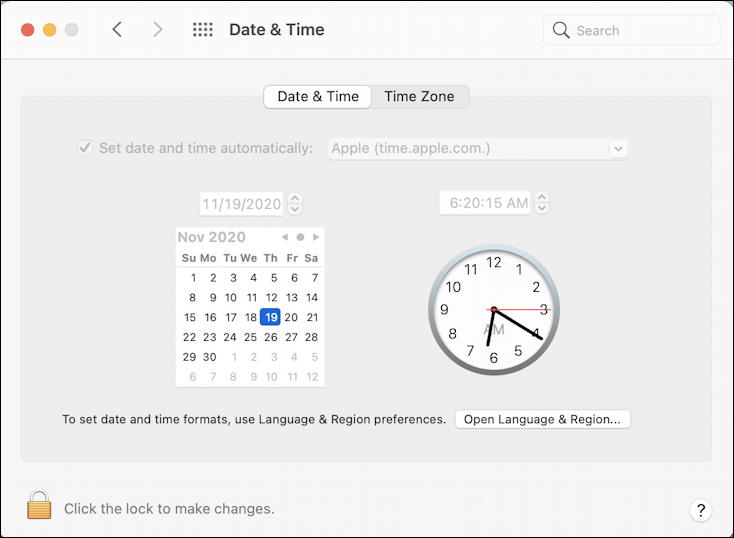
If you have a good memory, you’ll recall that the two tabs along the top used to be three tabs and that the third choice was “Menu Bar” or something similar. But it’s gone.
So where is it? Turns out it’s now tucked into the “Dock & Menu Bar“, a newly reconfigured system preference window. But it’s not obvious where you’ll find it either: You need to scroll down the left side until you find “Clock” and click on it. Then, finally, all of those time and date display options for the menu bar appear:
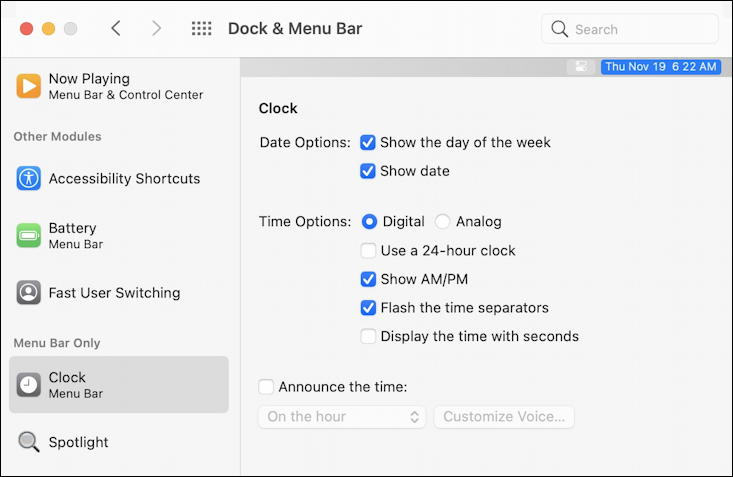
As you can see, I like to have day of week, date, and digital time with AM/PM displayed. Do I not know whether it’s ante meridiem or post meridiem? I do. I just like to see it as part of the display! You can tweak and adjust to your own heart’s content, making it either super compact or quite informative.
HOW TO FIX THE CLOCK DISPLAY IN THE MENU BAR
But that still leaves the annoying puzzle of how to fix the low contrast date and time display in MacOS 11 Big Sur. And the fix is something I stumbled across quite inadvertently. You need to Option-click on the time display and it’ll change to a higher contrast color choice. Option-click again and it’ll go back to “Big Sur default”. Documented? Nope. Useful? Heck yeah.
Here’s an example of the Big Sur default:
![]()
and the change when Option-click is used:
![]()
Then I wondered whether it would hold true on a black menu bar too, or whether it was grey/black as the two possible color choices. Good news is that it is actually switching between low contrast and high contrast, as you can see:
![]()
where it’s barely readable at all, and…
![]()
Hopefully the change survives a restart, but at least you now know that fixing this pesky user interface mistake in Big Sur is just an option-click away!
Pro Tip: I’ve been running various versions of MacOS since the beginning and have a huge number of tutorials here on the site offering up MacOS Big Sur help. Please do check them out while you’re visiting, I’m sure you’ll find more of value!
So you can no longer make the clock font bigger, and change the color on the new M1 Imac? This seems like a big step backwards, along with the removal of the optical sensor, ordered a gizmo from an aftermarket company so I can use my old Apple remote from 2008 on my new Imac – I don’t want to fool around with an iphone app to turn my computer off from the bed – while watching youtube video’s –
Many thanks, it’s been vexing me for quite a long time. For everyone’s information it works just the same on an M1 mac.
Why would you need to click the time while holding “option” to make the time visible? What a strange design choice…
Either way, thanks. The inability to read the time on my new 2022 Macbook Air M2 was driving me nuts.
SO helpful. Such a weird “feature”.
This worked a charm for fixing the weird faint text color on my Mac! Thank you so much. Such a simple, absurd fix.
I submitted this as a bug report to Apple at https://www.apple.com/feedback/macos.html. Do Not Disturb should not have a disturbing pop-up purple notification you can’t opt out of, and it should not be linked in any way to whether or not you can see what time it is on your Mac. I really don’t know who’s designing these systems anymore, they’re putting a lot more effort into their hardware than their software and it shows. There are so many little inconveniences like this showing a lack of thoughtfulness and testing. You can’t even shift-click to select a sequence of photos in icon view anymore, and I’ve been submitting bug reports and feature requests about that for years. I actually miss the old systems.
This is absurd. I literally never want to be disturbed. BUT I ALWAYS WANT TO SEE THE DATE/TIME!!
+1. super frustrating. can’t understand the rationale at all to gray out the time, have it be default with no opt-out, and just surprise people with it. it’s incredibly dumb as a concept to lump together clocks and do not disturb.
In macOS Monterey (and probably older os as well), when the system goes to Do not disturb mode, it will grey out the clock. If I turn off the Do not disturb, the clock will back to normal.
This is dumb.
Agreed, PL. I like the *idea* of it subtly showing you if you’re in Do Not Disturb, but why not something like a tiny open/closed eye icon or something else that’s not quite so annoying from a UI experience perspective? Ahhh… Apple.
apparently you can do it in System Preferences > Dock & Menu Bar > Focus and select Show in Menu Bar. that should show a focus icon instead of dimming the clock.
Awesome! mv found the right hidden control!
System Preferences > Dock & Menu Bar > Focus > Show in Menu Bar
you just made my day !
thanks for sharing
Yep, its been bugging me too. Typical annoying change Apple do then hide it!
Thanks Dave!!
Thank you so much i can’t thank you enough because i tried to restart my mac twice and still does not work and try researching Thanks alot but i was wondering what is actually they problem?
This article is helpful, but inaccurate. The best solution I have found is to go to Preferences → Dock and Menu Bar → Focus/DND and turn on the “Show in menu bar” option, with the setting for “when active”. It’ll show the icon for DND/Focus mode when it’s on, without ever toggling the display of the clock/date.
It’s not inaccurate, it’s just another way to solve the problem, Josh. In any case, thanks for the alternative solution.
Good call. I had the focus icon displayed in the menu bar, and recently turned it off in an attempt to reduce clutter. I noticed the dimmed clock display a few days later, and knew I’d done ‘something’ up there, but wasn’t sure what could have done it.
It really is a poor design choice dimming only the clock. Either do nothing (and let us reduce clutter!) or do the whole menu bar…
Worked for me as well. Thanks mate!
I think the dimming is actually a “Feature” gone awry where the clock is dimmed as it’s considered “not active” or something.
Basically, because they’ve combined Banner Notifications/Notification Center with the Clock as it’s “on/off button”, the two features now clash.
Option-clicking the Time actually has a different purpose – it’s meant to show/hide Banner Notifications.
So when the Banner notifications are Hidden, the “button” that shows notification (aka. the Date/Time!) is dimmed, indicating that it’s been disabled.
The side-effect is that most us now have to squint to read the Time!
Option-Clicking the Date/Time showed a few hidden banner notifications I didn’t know about, AND un-dimmed/brightened the Time.
After I closed those Banner notifications, the Time stays lit, AND even if I option-click it again it stays Bright – perhaps because there are no notifications being Hidden this time – ie. the dimming is possibly meant to indicate that active banner notifications are being hidden.
I think the reason adding the DoNotDisturb icon to the menu fixes this is because now the OS uses the DND icon/dimming to indicate that notifications are hidden.
With no DND icon, it instead uses the Time to indicate hidden notifications, by dimming it.
bingo! option-click time in menu bar toggles on/off Do Not Disturb
It’s not inaccurate. I literally just did it and it worked.
Thanks for this…seems to work on my new Macmini M1 chip.
If you add the do not disturb icon to the menu bar that takes care of the issue. Instead of the date and time being low contrast, the do not disturb icon will toggle back and forth depending if its on or not – this way your clock will always be high contrast regardless of do not disturb.
Thank you!
Thank you so, SO much!! I can’t thank you enough! 🙂
Thank you so much!
I can’t thank you enough.
Option-Clicking actually toggles Do Not Disturb… it doesn’t actually “fix” the problem of wanting to see the clock when in Do Not Disturb mode. Also, interestingly, I don’t have this problem, but my wife does, and it’s only been around since Big Sur.
Correct that it doesn’t “fix” the problem, but when do this, you can then read your clock. So on the other hand it *is* fixed. Until Apple realizes that dimming the time is a really daft way to give the user feedback on the do-not-disturb feature.
Hi Dave. just my 1 1/2 cents….
I do agree with Josh that it is ‘inaccurate’. or maybe just ‘incomplete’.
I would state the answer as — Disabling DND (or Focus mode) fixes it. Option-Click is a quick way to do that…..
In other words — only saying Option-Click fixed it, without warning about the side-effects of that, is… well… just incomplete and inevitably leads to another problem — why am I being disturbed now?…
🙂
Thank you much for the blog. I am sure I’ll be back since I am new to Mac (after 40 years with PCs) and not enjoying it (yet).
A fair comment, Thomas. And yes, I have hundreds of Mac articles that go back years, so any questions you have I probably already address. If not, click on that Ask link and shoot me your question!
When using Accessibility>Display>Reduce Transparency you get the black font on light background back. That has a much higher contrast.
Hello, Expert friend, I prefer always to use the date format used throughout the entire world except the US: day always before month. Is there a way in Big Sur to force the menu bar Finder to display “16 Jan” instead of “Jan 16”? Also, for me (on a 2-year-old MacBook Pro), the Option+click trick brings up a crescent moon icon that apparently stands for “Do Not Disturb”—it has no effect on Clock display brightness. Please advise! Merci!
Absolutely. Date formats can be specified in System Preferences > Language & Region > Advanced… then go to the Dates tab. However, upon testing, I’m not sure that the menu bar time honors this setting. It might need a full system restart.
How on earth can you get the YEAR to show up…
I have an M1 MacBook Pro and it was fixed with Option-Click as well (or just disabling Do Not Disturb)
This is great
I had the same issue and did not realise the dark clock meant DND was on.
So this ‘option click’ to toggle DND which ‘fixes’ the low contrast is GREAT
The low contrast version is an indicator that the “do not disturb mode” is on…. an option click on the clock tootles the do not disturb mode
That’s a good point, Thomas, but it’s a startlingly poor UI experience for Apple, in my opinion…
Yes, it would be better if the date greying out with Do not disturb would be an option…
Thank you very much!! I thought it was my eyes…
YES! Thank you very much. I searched for hours for that solution!
Sooo much thank you! You saved lot of my f’ing time!
Thank you SO MUCH for this! I don’t know why they made it such a low contrast either.
I just did this option-click on an M1 macbook pro and it works on that too.
Thanks again!
-Ira