
Apple iTunes on the Mac seems to be so locked into a single way of showing me my music library. It’s annoying. Is there any flexibility?
The iTunes program has been around a long time. I mean, a really long time. It was initially an indie program called SoundJam MP released by a small company called Casady & Greene in the late 1990’s. Apple bought the program in 2000 and in January, 2001 release the 1.0 version of iTunes. That’s a really long time for a program to be floating around, I’d say!
It also explains why the user interface is a bit confusing and somewhat Byzantine; back in 1999 they weren’t thinking about libraries of thousands of CDs, streaming services, online stores, podcasts, commercial music services and even Internet radio stations. For years I have been a proponent of Apple breaking iTunes into a couple of separate programs for just this reason; simplify instead of continuing to absorb yet more functionality like The Blob in the old McQueen movie.
But they’re not listening to me. Go figure. Instead we get to just struggle through the spaghetti. Indeed, the feature you seek is one that has the weirdest pop-up menu I’ve ever seen in any Mac program. But we’ll get to that.
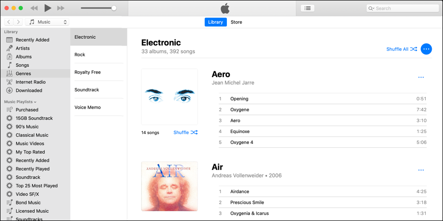
By default, all albums are sorted by title, whether you’re looking at a specific genre or your entire library. Like this:
Logically, you could put a “sort” feature in the main menu that pops up from the blue “•••” button on the right side. Logically. But instead, here’s what you get on that menu:
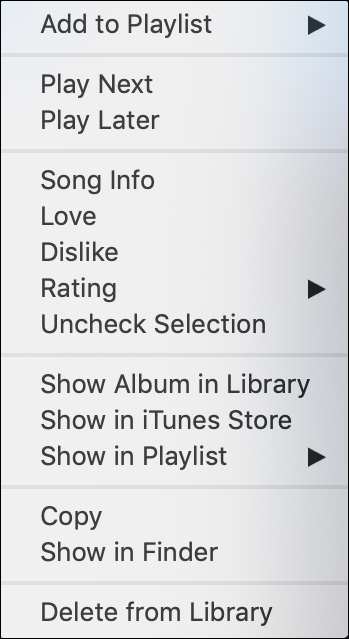
Confusing because it’s not an album but an entire genre. So what does “Show in iTunes Store” mean? Turns out that it doesn’t actually do anything, so indeed it’s a bit of a user experience hiccup. More importantly, no sort option.
There’s a menu that offers two ways to get to sorting, however:
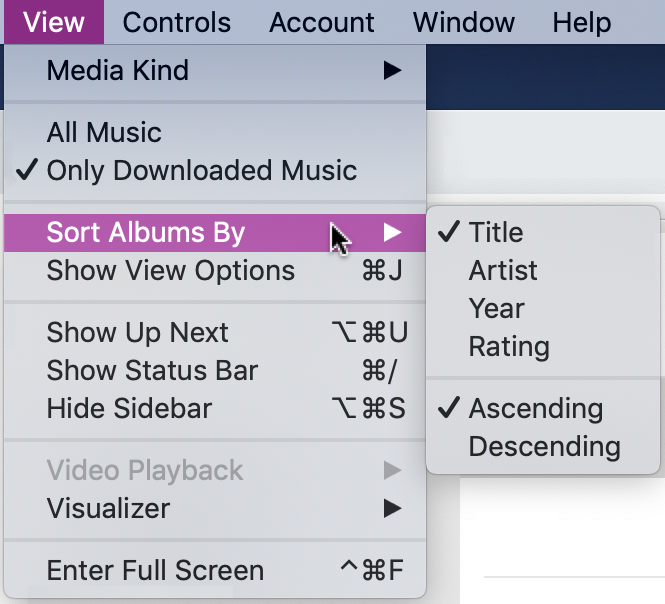
As you can see, the default “Sort Albums By” is to sort by album title, ascending (e.g., A-Z). I actually prefer to have things sorted by artist and sometimes I’ll switch to Descending so I see different things when I open up a playlist or genre.
But it’s the option below it, “Show View Options” that’s more interesting because it pops up the world’s smallest little window:
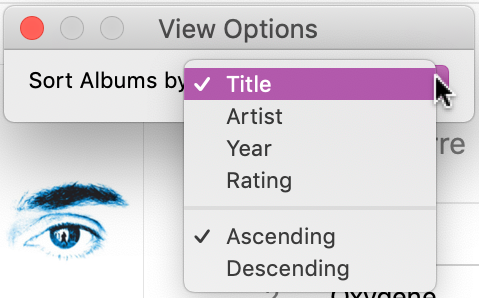
For reasons I cannot explain, there aren’t really any options here other than sorting, which you can already change. Why not have this be “show individual tracks” or “covers only” or “artist profile view” or other ways that you might want to view your music library?
Here’s an example of how little it’s evolved in almost 20 years, the main window from iTunes 1.0, as released back in Jan, 2001:
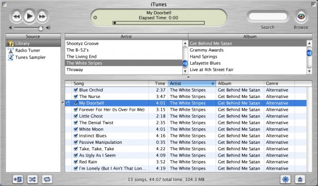
Image credit: MacRumors.
I concede that writing a music library manager is darn tough because it’s such a complex problem. Heck, Microsoft threw in the towel with Windows Media Player when Windows 10 was released and had to restore it as an optional download. Still, more flexibility would be a great addition to iTunes and the larger your library, the more you wish it had greater flexibility with music, artist, album and track display. Ah well, maybe in the next release of iTunes. Meanwhile, now you know how you can experiment with this rudimentary sorting feature within the program.
Pro Tip: While you’re here, please do check out our quite extensive Mac help pages. We’ve got almost as many as Apple does!
Just a note that the Steve McQueen movie was “The Blob”, not “The Blog”. 8^)
Though, as a movie about an ever-expanding entity that reaches an entire population, it might have been a prescient title…
We’ll chalk that up to a prescient typo. Fixed. 🙂