
My firm is debating a redesign of our site after we got two email messages saying it’s hard to read on smaller Windows PC screens. My suspicion, however, is that the vast majority of our site visitors have big screens and are Mac users. How can I tell?
You sound like a company that should be tapping into the amazing power of Google Analytics to capture more data about your site visitors. Formerly a product called “urchin”, Analytics is a free and very slick way to gain tons of insight into your visitors, how they find you, what they do once they’re on your site, and what kind of gear they have when they do visit.
You can easily get started by clicking on “Sign Up Now” on the Analytics home page. It basically involves you getting a snippet of code, about ten lines, and pasting it into your page source. If you’ve a content management system like Drupal or a blog, you can paste it into your “template” pages, rebuild everything, and you’re good to go. Remember, however, that any pages that don’t include the code can’t be tracked.
Now, once you have the analytics code on your site for a day or two, you can start collecting data. Log in to your account, then on the left look at all your options after you click on “Visitors”:

As you can see I’ve already chosen, let’s start with operating system, since it’s always an interesting question about Mac vs PC. Here’s what Google shows me:

I have more Mac content than PC content, but Analytics shows that more people running Windows come to my site than people running Mac OS X. Hmmm…. interesting. Now those people who visit my site from an iPod? Not sure what to make of that, but I guess an iPod Touch does have the ability to explore the Internet…
While we’re digging into stats, let’s look at some other slices of our visitor data. Here’s the breakdown on Web browser:

What are you using? I bet it’s Internet Explorer if these are accurate. Further, if you think of the implications of operating system and browser numbers, it must mean that there’s a meaningful percentage of site visitors who are using Apple’s Safari browser on their PC. There is actually another option “Browsers & OS” which would show that if it’s critical for you to know.
Next stat is screen resolution. This is the one you’ll want to pay close attention to and it should be quite revealing:

I’m always surprised how many people are running what I consider quite low resolution screens. The second most common screen resolution for visitors to my site is only 1024×768. This is important for a Web designer to factor in, for sure, because it’s not about your resolution or my resolution, but the common screen resolutions of your visitor base.
Another area to explore is your mobile traffic. I see about 7% of my traffic from mobile devices, and I can dig deeper by clicking on “Mobile devices”:

No surprise, three of the top four devices are Apple’s iOS gadgets, with the iPhone a strong leader in this regard. Of course, if I had more Android or Blackberry content on this site, those figures would undoubtedly be different, and they’ll likely be different on your site too.
One last stat: where do my visitors come from? I’ve selected “by continent” to have an aggregate picture, but you can also break it down by country and even specific cities if that’s critical to your traffic:
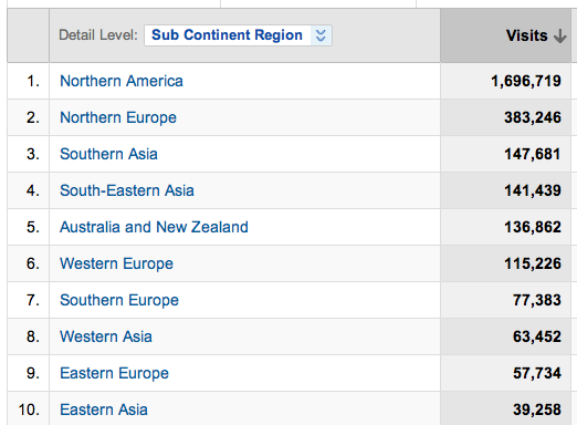
Looks like I need to drum up more traffic in Australia and New Zealand, doesn’t it? Field trip, anyone?
More seriously, you can see that with Google Analytics on the job, there’s quite a bit of data you can collect and view about the visitors to your site. Mac vs PC, big screen versus little, all of it’s there and easily found. Now, what you do with it, that’s up to you.