
My friends post quotes and questions on Facebook, but they’re really pretty with rainbow backgrounds and really big letters. How do they do that?
Many years ago there was a social network called MySpace that was known both for its popularity (it was really the first big social network) and its crazy design: since people could use whatever color schemes and images they wanted, the site was typified by some pretty wild user profiles. I can remember grey on dark red, for example, and lime green on blue, both color pairings that were completely unreadable. And then there were the flaming skulls. But that’s another story! 🙂
Facebook stood out when it appeared on the scene because it didn’t let users create all these crazy profiles and instead had a nice, clean design with little clutter and a consistent blue and black on white color scheme. Helped a lot of people feel like they could indeed read what was on the screen without risk of a migraine popping up! Until recently, when Facebook has become more cluttered and even allowed people to create bright, colorful, some-would-say-too-colorful status updates with the click of a button.
Still, since the goal on any social network is get people to notice what you’ve posted or shared, there’s some logic to it anyway, and I’m not against using it myself on status updates I want to have gain much visibility. So let’s talk about how to do it, and I’ll share a cool trick along the way too…
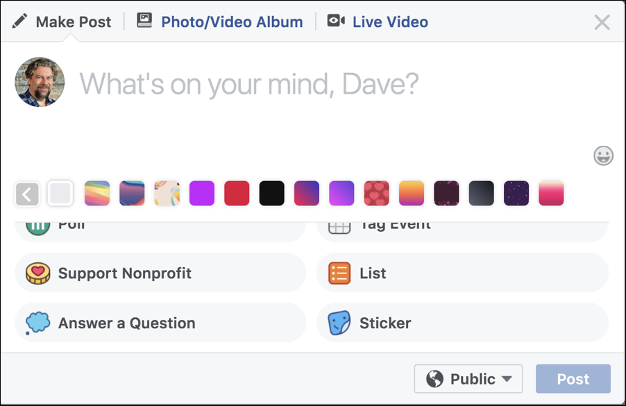
To start out, here’s the standard status update box. You’ve seen it a thousand times:
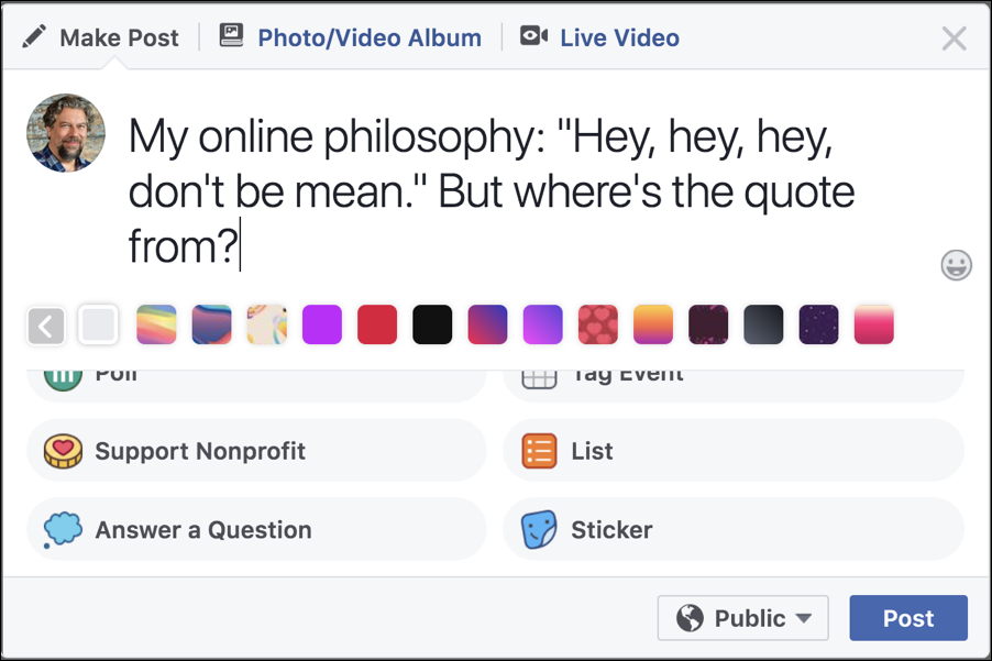
Start typing and everything pretty much stays the same:
See that strip of tiny color icons just below the text, however? That’s the secret to getting things bright and colorful. Click on one and it not only adds that as a background to your status update, but it makes the text bigger too. Here’s an example of a rainbow background:
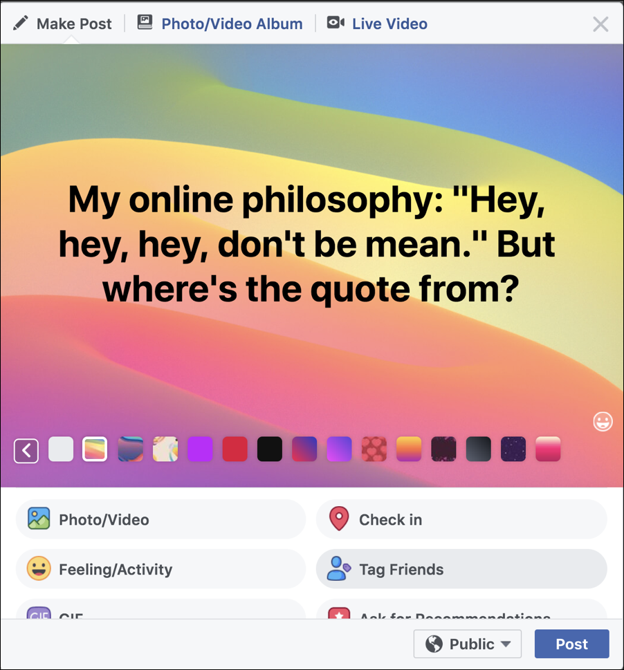
Cool, eh? Now, here’s a trick you can use if you would like to have the line breaks in different places: move the cursor to the correct spot, then type Shift-Enter. It’s what’s known as a “soft return” and will help you flow the text better so it’s more what you’d like. I used it to move the first word of the quote to the second line:

As you can see, it’s a bit easier to read now. You can click on various of the colored icons to try different background designs and options, and click on the white icon (the leftmost) to disable the colored background feature entirely. have fun, remember it’s all about gaining visibility, right?!
One more thing. While I’m at it, I’ll click on the “Feeling/Activity” button to add an emoji:

All looks good. A click on “Post” and…
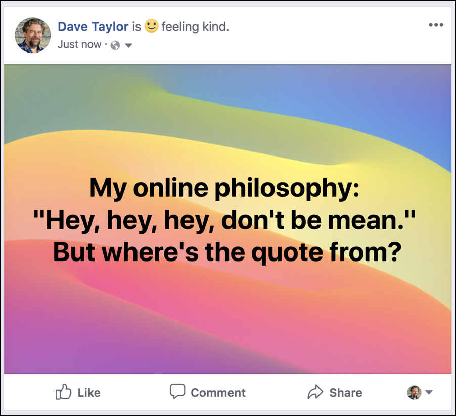
Definitely attention grabbing, isn’t it? Now, let’s see if anyone can identify the source of the quote…
Pro Tip: We have a ton of Facebook help here on the site. Please take the time to check it out!