
I am supposed to use Google Docs to create some spreadsheets in a class and I’d like to make them attractive and functional. Can you offer some basic tips on how to format Google Sheets spreadsheets to look nice?
I remember the first spreadsheet, Lotus 1-2-3, and being so impressed with the basic idea that you could divide up the computer screen into a grid, assign values to each cell, and define relationships between ’em. Surprisingly, that same core idea is the heart of even the most advanced financial modeling software and that same idea also spawned HyperCard and a wave of subsequent easy database programs. The problem is that it’s never really become easy to turn that basic grid into something attractive without lots of fiddling.
Unfortunately, that’s still the case with Google Sheets (and Excel, and Numbers, and so on). Probably the most important feature to learn is simply that you can click to select a cell, then shift-click to select another and have every intermediate cell between them automatically also be selected. Choose a row and you can change the font. Choose a column and you can change the data format. Choose the two corners of your data and you can copy it without any empty cells or apply a format to every single cell at once.
BASICS OF GOOGLE SHEETS SPREADSHEET FORMATTING
The best place to start is with column headers, which are weirdly not easy to create in Sheets. Let’s just start with a basic spreadsheet:
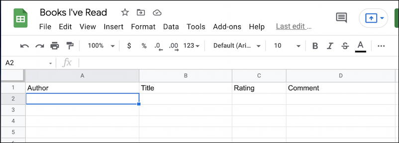
You’ve probably seen plenty of these if you’re busy creating spreadsheets for your class.
It’s easy to click and replace the title and enter words into row 1 of the table to add column titles:
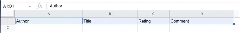
Now click on cell A1 (in this instance, it’s the “Author” cell). Hold down the shift key and click on D1 (“Comment”). Now you’ll have all four of the title cells selected:
Let’s start with some colors. With those selected, go to the toolbar and look for the tiny paint bucket. It’s on the right side of the row of icons. Can’t see it? Click on the “•••” and another row of otherwise hidden icons will appear:
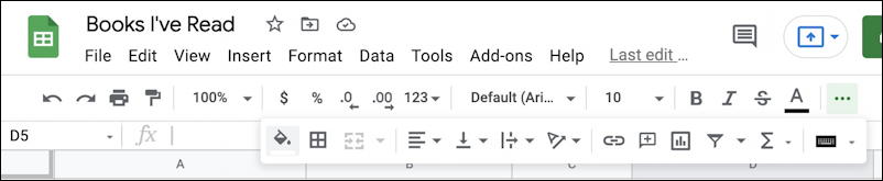
Can you see the paint bucket icon? It’s directly below the “$” icon in the above pic.
Click on fill and a color palette will appear:
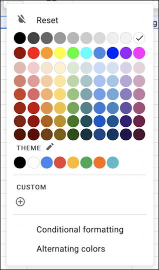
Lots of colors. Take note of “Alternating colors” too, we’ll come back to that in a bit. For now, however, I’m going to pick purple because, well, who doesn’t love purple?
All four selected cells instantly change to have a purple background:
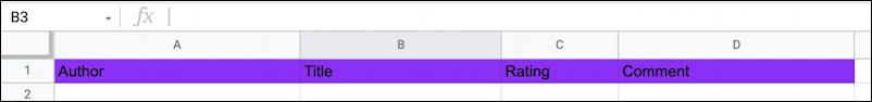
Nice color, but now the text is illegible because black on dark purple isn’t a good pairing. No worries, choose all four cells again and this time click on the toolbar icon that looks like an “A” with a thick line underneath. You’ll get a very similar color palette, but this time it’s for the text color:
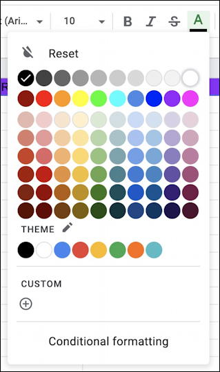
I’ll choose white because that should make the letters far more legible against that dark background and… it does! While I’m at it, however, I am going to also center align the column titles. With all four cells still selected this time it’s the alignment icon that needs to be clicked, as shown below:
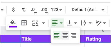
Spreadsheets are one of the few areas where right-aligned content makes sense, particularly if you’re working with columns of numbers. For this task, however, center aligned (the middle of the three choices) works just fine.
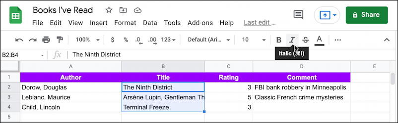
You can apply that same group selection option to apply other formatting too. For example, if I want to italicize the book titles in my table, I can use the click + shift-click to choose everything in column B (except the title!), then click on “I” to italicize:
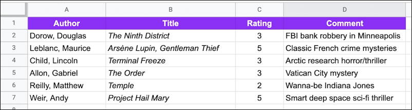
After a bit more data entry, here’s my spreadsheet, looking pretty smart:
There are two problems with it, however: I’d like to have it sorted by author name and I’d like to denote the first row as the column titles so that if users scroll that row is locked into place. Both are doable in Google Sheets, though neither is super easy…
SORTING AND FREEZING ROWS IN GOOGLE SHEETS
The problem with sorting is that by default what I think of as column titles the program just sees as another row of data, so a default sort will move one or more items above the column title row. Ugh.
The solution is to do what Google thinks of as freezing data cells. As with earlier, click and select all four column titles, then choose View > Freeze > 1 row, as shown:
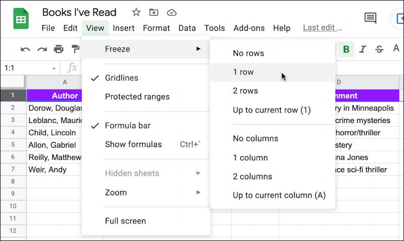
Now that row is locked into place at the top of the spreadsheet, even if you scroll the rest of the sheet to see later values. Cool. But even more cool is that it also automatically now excludes that row from sorting so a sort using Column A does exactly what we want. Even better, there’s a shortcut on the cell labelled “A” that you can use to sort, knowing it won’t also include the column titles.
But let’s do one more thing to make it look really cool. Choose the body cells (those with specific values) en masse, then go back to the fill palette and select “Alternating colors” from the bottom of the little window. A formatting pane opens up on the right:
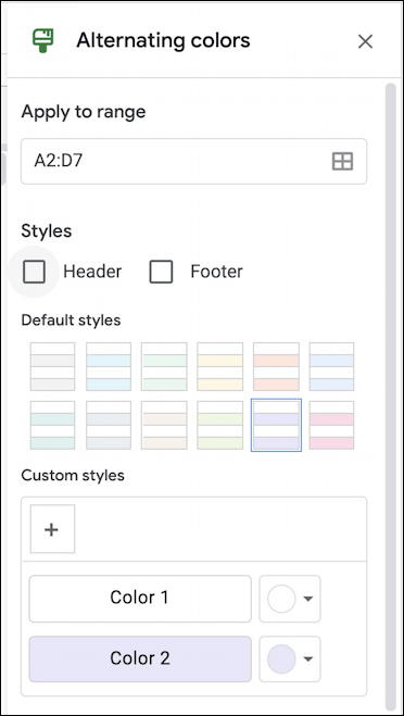
Since it shows instantly, experiment with colors, disable the Header and Footer as needed, and click “Save” when you’re done. Now the spreadsheet table looks terrific:
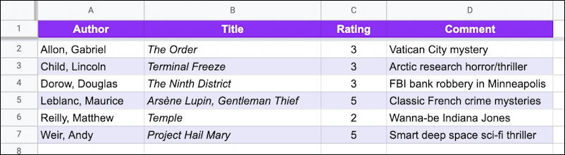
Notice that it’s also sorted by author’s last name, without messing up the column titles and, of course, odd-numbered rows have a subtle lavender background to help with legibility.
Very nice. Now have fun applying all these formatting tricks to your own Google Sheets spreadsheets!
Pro Tip: I’ve been writing about Google’s office suite and tools since the very beginning. Please check out my extensive Google Help Library for lots of useful tutorials while you’re here. Thanks!