
I use Twitter through my Web browser on my PC (easier to read the text that way) and am wondering if there’s a way to change the color scheme or theme to be more holiday related?
Smartphones are great, until you want to try and get bigger type to make the contents more legible. Sure, you can make the text larger, but then you suddenly realize just how small that screen really is. Convenient? Definitely. Inclusive? Not so much. Fortunately Twitter is one of many, many services that offers an identical user experience through a Web browser on your computer, Mac, PC or Linux, which means you can definitely increase type size with far less penalty!
Not only that, but Twitter.com as viewed through a Web browser has a lot of easy color and theme options and some accessibility features you can enable too, if you’re so inclined. Of course, some of those color combinations can prove challenging for legibility regardless of your vision, but that’s another story!
Let’s check it out. First off, here’s the standard, default, OG Twitter.com home page for my @DaveTaylor account:

Clean and legible, but boring. Black text on white with a blue highlight color. Wake me when it gets interesting! 🙂
There’s a nice big list of options on the left side. Click or tap on “More” and a menu pops up:
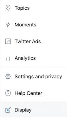
We’ll explore “Settings and privacy” in a moment, but for now, just click on “Display“, the last entry. Boom! A colorful window with color and theme options appears:
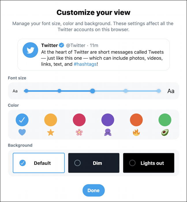
What a lovely way to present this information, eh? Really easy to understand how it all fits together. Want to make the text even a bit bigger? You can do that with the slider at the top.
For the holidays I’m going to switch to an orange highlight and “lights out” dark theme background. A few clicks and it’s a very different look!
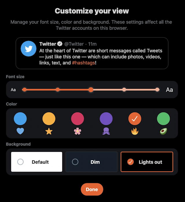
Looks good? I can definitely live with this for a few weeks! Oh, and Dim is a dark grey background while Lights out is a full black background. The difference is much more obvious when you view it at night rather than in the middle of the day. I prefer the slightly greater contrast of Lights out personally.
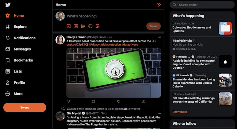
Quite a difference with this Twitter.com home view! Too much for you? Go to More > Display and change it up again!
Now, while you’re adjusting things to make them maximally legible for you, click on “Settings and privacy” off that same “More” menu…
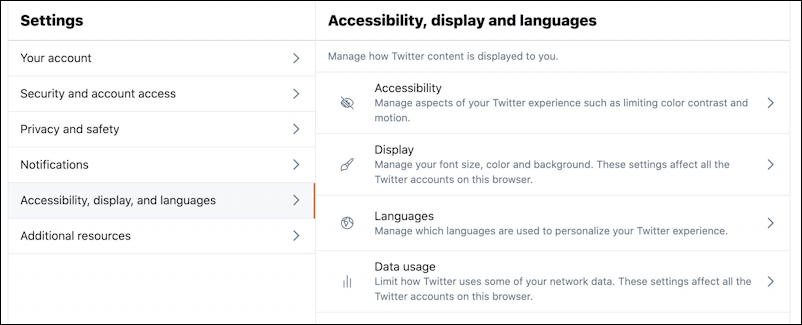
There’s a fair bit to explore here, and I definitely encourage you to view your “Security and account access” and “Privacy and safety” settings to ensure that they are optimal. I also counsel everyone to turn on two-factor authentication for account security too. Here’s a helpful info page from Twitter: Turn on 2-factor security for your Twitter account.
For now, however, click on “Accessibility” on the right side. You’ll see a few additional options:

Definitely change “Autoplay” at the bottom to “Never” as I have done to save all those annoying videos auto-playing when you’re viewing Twitter by clicking on the “>” adjacent. Now you can see that there are just a few additional Accessibility options worth testing out for yourself: Increase color contrast and reduce motion. Try those, see if it makes any difference at all in the legibility of the site.
And with that, you’re ready to customize the theme and experience of Twitter on your PC. Have fun!
Pro Tip: I’ve been writing about Twitter since the very early days and have a ton of Twitter help here on the site. Please do check it out while you’re visiting and why not follow me – @DaveTaylor – on Twitter too? I’m a very active user!