
I got a new Kindle and the type’s so small on the book I’m reading! Is there some way to make the type larger so it’s easier to read?
One of the great advantages of ebooks is that unlike a printed book you aren’t at the mercy of the design and layout sense of the printer. Get a book from the local library and if the type’s too small, well, then you’ll just have to suffer. Sure there’s the “Large Type” editions, but an ebook reader like the Amazon Kindle is really such a win by comparison because of how much you can fine-tune your reading experience.
Not only can you change the size of the type, you can actually change typeface in case a serif or san-serif face is more to your liking, change the leading (the space between lines) and the margins to have the electronic display be perfect for your own visual acuity and reading preferences!
To start, open up the Kindle app on your device:
In many of these screen captures I’ve trimmed down what isn’t relevant in the interest of space and readability, don’t be surprised if your screen lays out slightly differently. You can still follow along! 🙂
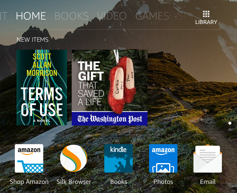
On the above screen you can see that new books, like Terms of Use by Scott Allan Morrison show up under New Items and can be tapped directly to read, but you can also tap on the “Books” app with the “Kindle” icon. Do so and a list of your books appears:
You can see what I’ve been reading lately. History and historical fiction, with a smattering of techno-thrillers. 🙂
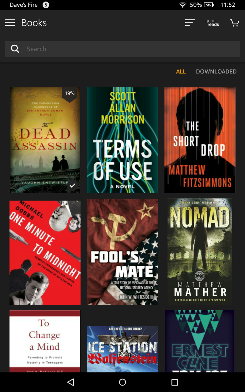
Notice the top left book The Dead Assassin by Vaughn Entwistle, and how it has a bookmark graphic on the top right with “19%” superimposed. That’s the book I’m readying and I’m at 19%. A handy way to see how far you are in the book!
Tap on the book you’re reading — The Dead Assassin in my case — and it’ll open you right to the current page:
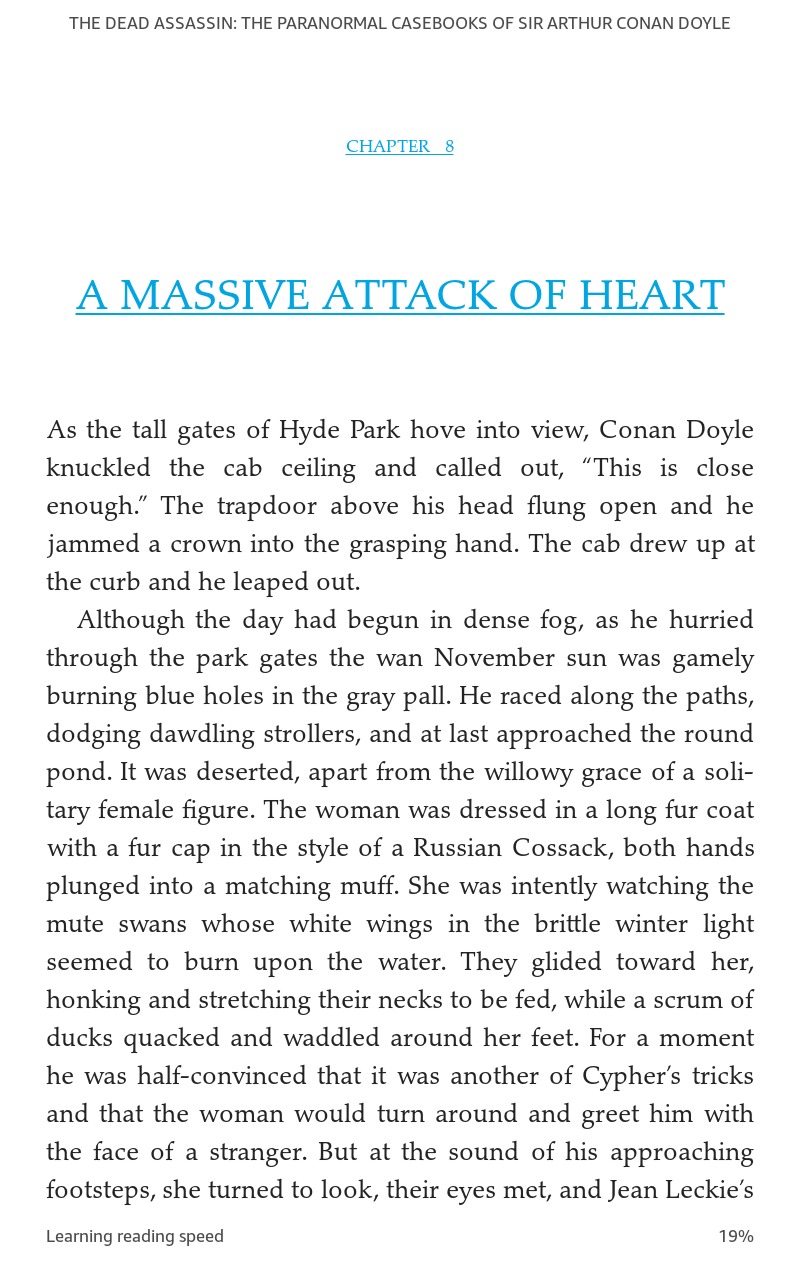
As you can see from the edges of the image, I have small text, narrow margins and narrow leading (inter-line spacing) to fit lots of content on a screen and minimize my page turns. Not everyone likes to read that way, so here’s how you change it…
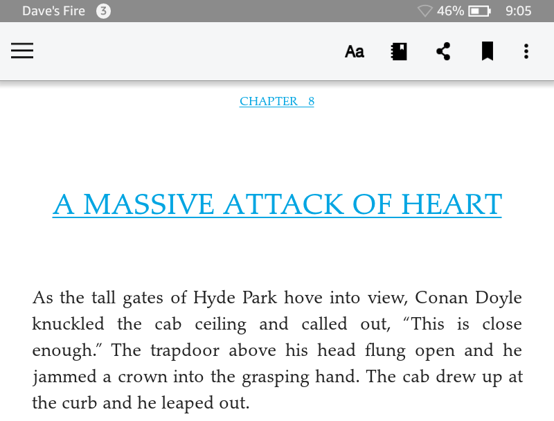
Tap anywhere on the screen and the app will bring up a number of options, including a control bar along the top edge:
The left button, the three horizontal lines, offers a way to easily go back to your library, sync this Kindle app with the system in case you’ve read further into the ebook on another Kindle (I alternate between Kindle devices and my Apple iPad so this keeps me nicely in sync), etc. What we want, however, is the button labelled “Aa” on the right side. Before I show you what that does, however, just a quick explanation that the subsequent buttons, left to right, is easy access to the Kindle “Notebook” for jotting down notes about what you’re reading, recommending the book to your social media friends, adding a bookmark at a passage of particular note, and the three vertically oriented dots offers access to Amazon’s “X-Ray”, “Word Runner” and additional settings. I’ve never used any of these, actually, but it’s likely there are neat capabilities hidden away if you want to explore. In particular, Word Runner looks very interesting from what I’ve read about this way to increase your reading speed…
What we’re interested in, however, is the “Aa” button, as mentioned earlier, so tap on that.
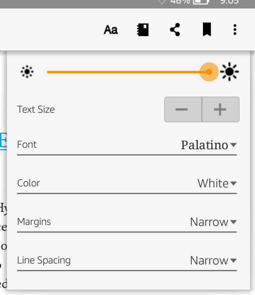
Everything you want to tweak, all in one handy spot! To start, you can increase or decrease the brightness by dragging the slider left to right. I keep mine on max to maximize contrast.
To change the text size is a breeze: Tap on “+” to make it larger, “-” to make it smaller. Experiment with different settings too, there’s no right or wrong.
You can also change the font used to display the text if it’s just not quite what you prefer:
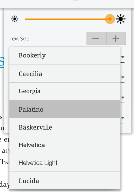
The differences between fonts are subtle in most cases, so the best way to proceed here is to simply try them all out. It’s worth noting that Bookerly is a font designed specifically for the Kindle and does prove to be quite pleasant and readable.
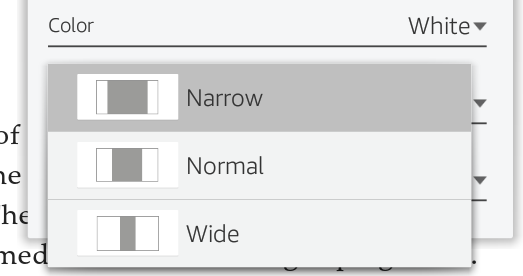
You can also change the color of the display, either black text on white (the default), white text on black or black text on a sepia background. The sepia can be quite pleasant if you’re reading in low light situations (like in bed) but I generally stick with the default of black text on white for max contrast.
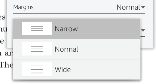
One thing you can change in an ebook that you cannot change in a real book are the margins. Yes, you can decide if you want wide or narrow margins on your book display in the Kindle app:
What I find a lot more useful for increasing readability is to tweak the spacing between the lines of text on the display, and that can be done with the “Line Spacing” setting:
More than any other setting, I find that changing from “Narrow” to “Wide” makes the most difference in readability and my own reading speed, at the cost of wider line spacing meaning you have to flip pages more frequently. Trade offs!
That’s a quick primer on your Kindle ebook app reader preferences, settings and options. I hope it helps you enjoy your new Amazon Kindle. Which one did you get, btw? A Fire HD? A Kindle Paperwhite? In my experience, they’re all terrific!
Teresa, I’d check with Amazon, they’re really good with support.
I have the Kindle Fire HD & changing the book section is easy. How do you change the font on Facebook, e-mail, etc. I was going blind at night trying to read this & google til I was blue in the face to no avail,. I ended up going to the expense of buying a paper white reader & an iPad Air for FB & email. Is there any way to change those fonts on the Kindle Fire HD?.